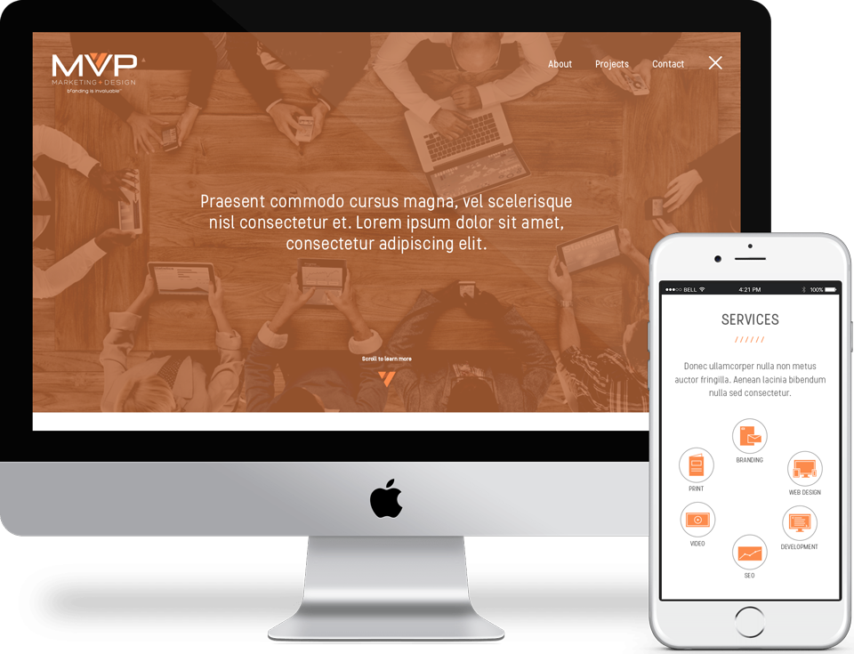
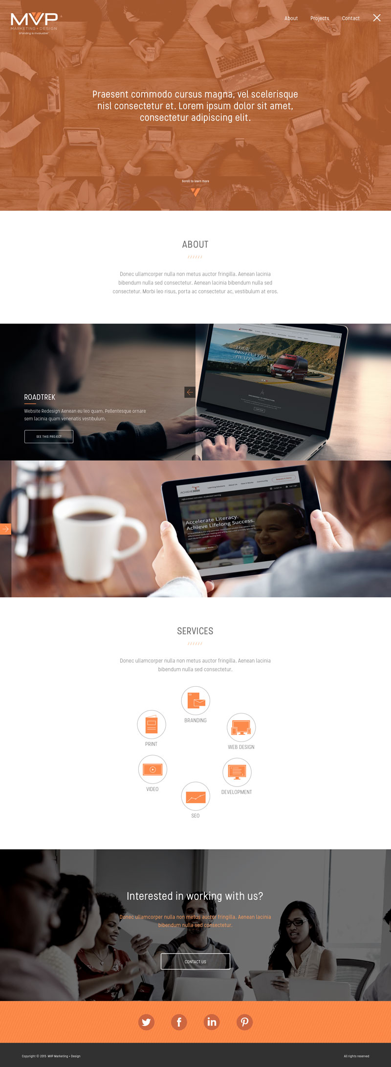
MVP Landing Page
design concept


On the event of updating the company’s branding guideline, MVP asked volunteer employees to come up with ideas for colors, fonts and imagery, creating a style sheet.
After analyzing the current guide lines and getting inspired by the latest trends, I began putting together a landing page using Sketch to find the balance between intuitive imagery, concise and powerful text and easy-to-navigate iconography aiming to create an enjoyable experience.
The concept I developed focused on modernizing the brand towards a flat, simple design:


